Practical CSS Tips for Better UX and Accessibility
Focus & Interaction
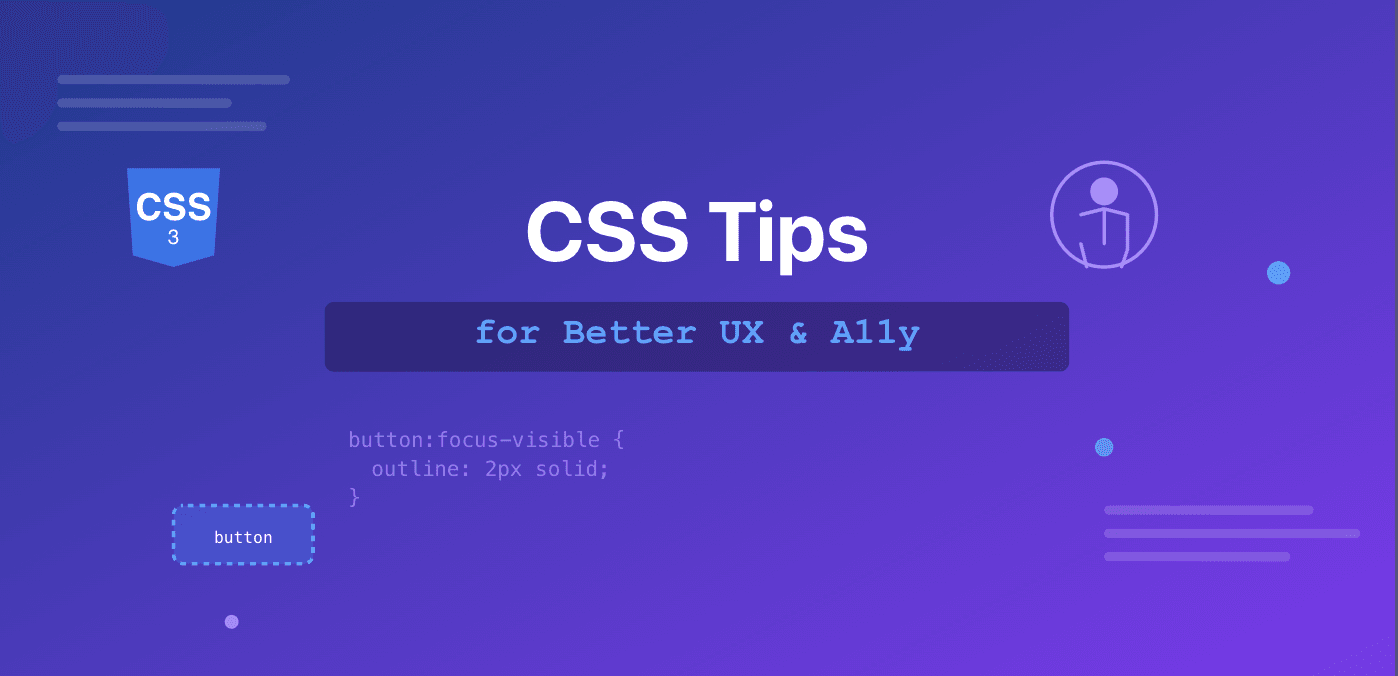
1. Use :focus-visible for keyboard-only focus outlines
/* Outline is shown only for keyboard-only focus */
button:focus-visible {
  outline: 2px solid blue;
  outline-offset: 2px;
}
2. Never remove outlines without replacement
/* Bad */
*:focus { outline: none; }

/* Good */
*:focus-visible {
  outline: 2px solid currentColor;
  outline-offset: 2px;
}
3. Use prefers-reduced-motion for animations
@media (prefers-reduced-motion: reduce) {
  *, *::before, *::after {
    animation-duration: 0.01ms !important;
    transition-duration: 0.01ms !important;
  }
}
Color & Contrast
4. Ensure sufficient color contrast
Text: minimum 4.5:1 ratio (WCAG AA)
Large text (18pt+): minimum 3:1 ratio
Use tools like WebAIM contrast checker
5. Don't rely on color alone
Make sure there is text or other clear indications to convey the message.
6. Use currentColor for flexible theming
.icon {
  border: 2px solid currentColor; /* Inherits text color */
}
Typography
7. Use relative units for font sizes
/* Respects user's browser font size preferences */
body { font-size: 1rem; }
h1 { font-size: 2rem; }
8. Set comfortable line heights
body {
  line-height: 1.5; /* WCAG recommends 1.5 minimum for body text */
}
9. Limit line length for readability
p {
  max-width: 65ch; /* Optimal: 45-75 characters per line */
}
Responsive Design
10. Use clamp() for fluid typography
h1 {
  /* Minimum: 1.5rem (24px) - won't go smaller, even on tiny screens
     Preferred: 5vw (5% of viewport width) - scales with screen size
     Maximum: 3rem (48px) - won't go larger, even on huge screens
  */
  font-size: clamp(1.5rem, 5vw, 3rem);
}
11. Make tap targets large enough
button, a {
  min-height: 44px; /* Apple & Google recommend 44-48px */
  min-width: 44px;
}
12. Use gap instead of margins in flex/grid
.container {
  display: flex;
  gap: 1rem; /* Cleaner than margin hacks */
}
Visibility & Display
13. Add a custom class to hide content for screen readers only
/* Screen reader accessible but visually hidden */
.sr-only {
  position: absolute;
  width: 1px;
  height: 1px;
  padding: 0;
  margin: -1px;
  overflow: hidden;
  clip: rect(0, 0, 0, 0);
  white-space: nowrap;
  border: 0;
}
14. Avoid display: none for focusable elements
/* Bad - removes from tab order */
.hidden { display: none; }

/* Good - visually hidden but still accessible */
.visually-hidden { /* use sr-only class above */ }
Forms
15. Style form validation states clearly
input:invalid {
  border-color: red;
}
input:valid {
  border-color: green;
}
/* But only after interaction */
input:not(:placeholder-shown):invalid {
  border-color: red;
}
16. Increase input padding for better touch targets
input, textarea, select {
  padding: 0.75rem 1rem;
  font-size: 1rem; /* Prevents zoom on iOS */
}
17. Style disabled states obviously
button:disabled {
  opacity: 0.6;
  cursor: not-allowed;
}
Layout & Spacing
18. Use logical properties for internationalization
/* Instead of margin-left */
margin-inline-start: 1rem; /* Works for RTL languages */
19. Prefer padding over height for vertical spacing
/* More flexible and accessible */
button {
  padding: 0.75rem 1.5rem;
  /* Not: height: 40px; */
}
20. Use aspect-ratio for responsive media
.video-container {
  aspect-ratio: 16 / 9; /* Modern browsers */
  width: 100%;

  /* Fallback for older browsers */
  @supports not (aspect-ratio: 16 / 9) {
    padding-bottom: 56.25%;
  }
}
Dark Mode
21. Support dark mode preferences
@media (prefers-color-scheme: dark) {
  body {
    background: #1a1a1a;
    color: #f0f0f0;
  }
}
Performance
22. Use content-visibility for long lists
.list-item {
  content-visibility: auto;
  contain-intrinsic-size: 0 200px;
}
23. Optimize animations with will-change
.animated {
  will-change: transform; /* Use sparingly */
}
Misc
24. Use pointer-events carefully
/* Be cautious - affects accessibility */
.overlay {
  pointer-events: none;
}
If you need to disable all user interactions on an element, consider using inert attribute:
Removes elements from tab order
Prevents clicks
Hides from screen readers
Can be toggled with JavaScript
// Toggle overlay
overlay.inert = false; // Make interactive
overlay.inert = true;  // Make non-interactive
25. Add :has() for parent-based styling
/* Style form if it has invalid input */
form:has(input:invalid) {
  border: 2px solid red;
}
26. Use scroll-margin-top for anchor links
:target {
  scroll-margin-top: 80px; /* Accounts for fixed header */
}
27. Smooth scrolling (with motion preference)
html {
  scroll-behavior: smooth;
}
@media (prefers-reduced-motion: reduce) {
  html {
    scroll-behavior: auto;
  }
}
These tips will help you build more accessible, user-friendly interfaces that work well for everyone, regardless of their device, abilities, or preferences.